


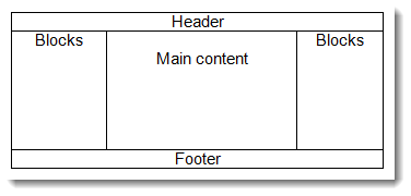
Recently, Moodle has become a responsive application which means, regardless of the device being used (mobiles, tablets, iPads etc), users are able to see their Moodle content nicely laid out regardless of screen size. Until recently. this only used to be the case on larger devices where we get the standard Moodle structure of;
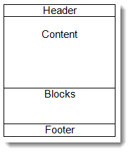
Now when a mobile device with a much smaller screen views the Moodle content, we get something like this;
This change in how the site is displayed in different sized screens, has been made possible by the use of a framework called Bootstrap. It comprises of a number of tools and templates that were originally conceived by Twitter developers as a way to get consistency in their site as the various tools and features within Twitter were being created by different developers and were being displayed on different devices.
Now that Moodle themes use the Bootstrap framework, it means that course developers can also use it to introduce new features, for example sliders and make course content look more appealing. I was reminded of this as I was working with an image for one of our clients recently.
When working with images, I usually start off by determining how big the image needs to be and I resize it to those dimensions. I always suggest to clients that best practice dictates all images should be resized before being uploaded to Moodle, particularly photographs, because no matter how you change the dimensions of an image, the file size of that image will not alter. The most obvious consequences of not resizing images are with regards to time; large images take longer to download so pages take longer to appear in full, and to upload. Less obvious consequences concern data transfer; for those users on a limited data contract, you will be unnecessarily contributing to your personal data transfer limit, as well as impacting on your site's data transfer and storage limits.
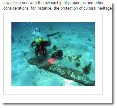
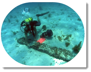
Anyway, getting back to the image, once it was the right size, I needed to add a border so that it looked like this;

Usually I would do this in my graphics program, but it does take time so what I did this time was to use Bootstrap to do it for me as this would allow the site's administrator to amend the border size without the need edit the image. Much easier for all concerned.
Go into the text editor where you want to add your image and add it in the usual way by clicking the [ Insert/edit image ] on the toolbar. The next bit is going to be different depending on which version of Moodle you are using;
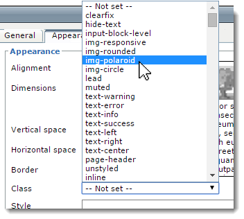
For those using older versions of Moodle or preferring to use the TinyMCE HTML editor, once you have selected the image, click on the Appearance tab, and from the Class dropdown, select img-polaroid.
For those using the latest version of Moodle using the Atto text editor, this is a little more difficult in that you cannot select the class from the dropdown so have to delve into the code.
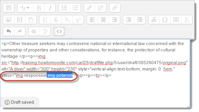
Within the Atto editor add your image using the [ image ] button. Once added, you then need to click the [ < > ] button, which will display the HTML code (don’t be nervous!). Search for your image’s file name in the editor (I called the image, original.png).

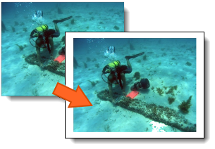
After the filename in the code are some properties of the image, e.g its height, alternate text, etc., and amongt these is the class. Images automatically get a class called “img-responsive” in the Atto editor which allows the screen size to affect the size of the image. After this, add “img-polaroid” and save the changes. If you wish to make the area between the image and the outer border wider, you can add the padding property. I added padding: 2em; to the style tag.
This screenshot is the result;
The other effects that you can add to images by adding classes are img-circle and img-rounded, giving the following;

You can add classes together so that you get, for instance a circular image with a white border by adding the “img-circle img-polaroid” as the class. If you are using the MCE editor, it may be useful to you to add the img-responsive class too so that the image resizes.
Looking for more information about the Moodle Themes?
Find out how to Get a Multi-Tenancy effect on your Moodle Site here.
Or, you can check out our Branding Services here.

Explore HubkenCore – our unique SaaS LMS offering
Ready to see how our new LMS bundled solution is revolutionising how you purchase an e-learning solution?


